There’s never been a better time for finding the perfect wallpaper. It’s enjoyed something of a renaissance in recent years. Gone are the days of the dreaded wood-chip and in comes an abundance of pattern, texture and colour. With history dating back to the 1400s, wallpaper has always played a part in enhancing interior design and the nation is finally realising its trans-formative power in lifting a room. Designs that were once considered dated now have hearts skipping a beat, and people are more open to giving it a go. But with an overwhelming variety on the market, where do you begin? Whether you’re planning to purchase your first roll or figuring where best to paste it, read on for our top tips on finding the perfect wallpaper.
Try Before You Buy
If you’re using wallpaper for the first time, experimenting with a small square sample isn’t always helpful. Instead, invest in a roll and temporarily pin the wallpaper to your chosen area for a week. Use the space in question as normal and see how it makes you feel. Look at the space at different times of day – lighting can change your wallpapers appearance considerably. This should help in figuring whether you can live with it.
Test the Water
For newbies, a separate loo, cloakroom or dressing room is a fantastic opportunity to give some wallpaper a whirl! Interior design myths suggest these spaces should be painted a light, airy hue to make them feel bigger, but remember – without floods of natural light, that rule doesn’t work. In fact, larger patterns can often work harder in giving the illusion of more space.
Let your imagination run wild as spaces in which you spend only short spurts of time will ensure your interior design looks fantastic, without being too overpowering. Smaller spaces are more affordable to experiment with and it’s a little easier to justify splurging on that designer wallpaper you’ve had your eye on – after all, you need less of it!
ALL OR NOTHING
If you’re going to do it, then go the whole hog! We’re not big on the accent wall at Mon Interiors – except when using a mural. It can appear a little dated and doesn’t have the same effect that a wallpaper should. Using wallpaper on all walls evokes a more cohesive, high-end feel with heaps more impact.
MURALS
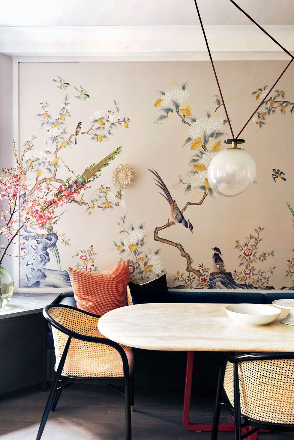
If there’s one way to get your guests or customers talking, it’s by installing a wall mural. They’ve really taken off over the last few years, and their high-impact and realistic finish is guaranteed to bring some WOW factor to your interior design. Murals are different to wallpaper. They are individually produced (rather than in bulk) and are made to order to a custom size. Some companies even produce bespoke prints, so the options really are endless. Companies doing wall murals really well are: Woodchip & Magnolia, Surface View, and Murals Wallpaper. With an incredibly wide range, there’s something to suit all tastes.
STYLE
Different wallpapers work with different types of architecture. First, consider the style of the room you are decorating and the story you want your interior to tell. Are you looking for a statement wallpaper to contrast against simple furniture? Or maybe you are looking for backdrop to support more decorative furnishings and accessories? Determining the level of contrast you require is essential; it can make or break a design.
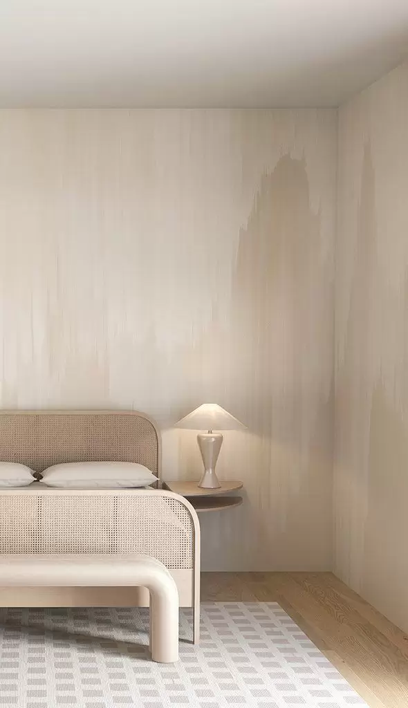
In contemporary homes, textured wallpaper works well to bring depth and warmth to a room. Where as more intricate patterns and stripes often look stunning in more traditional settings. Bold, geometric style patterns make a fantastic statement in commercial or occasional spaces and soft tones and prints will evoke calm and sophistication.
Once you’ve decided on a style, gather a handful of samples you like and trust being led by your own instinct.
BEWARE OF PATTERN OVERKILL
Don’t over do it. Refrain from synchronizing your wallpaper to curtains, rugs, cushions and table wear. This type of matchy-matchy style will look too uniform, tacky and dated. Compliment your chosen wallpaper by accessorising the room with colours taken from its wallpaper is a better option.
If you have existing patterned furnishings, a plain, textured design is better or perhaps just a lick of paint. A wallpaper with too strong a print will clash, looking disorganised and messy. Check out our blog post on how to mix and match pattern too.

THE FIFTH WALL
Don’t feel restricted to papering your walls. The ceiling is a striking place to make a statement, yet it’s probably the most neglected element in modern day interior design.
Take some inspiration from the sophistication of pre-1920s interior design, where ceilings were elaborately decorating with decorative plaster, gilding and fresco paintings to give a room a new lease of life. It’s a great way bring some wow factor to a room and will definitely get people talking!
COMMITMENT-PHOBES
Does the thought of wallpaper still give you cold sweats? There is another way to incorporate your perfect wallpaper into your interior design which requires a little less commitment.
Try creating panels of framed patterned wallpaper to accent blank space. For this, you need to go BIG and hang the panels in the same way as you would with art. It’s a great way to add a focal point to a space if your budget doesn’t stretch as far as investing in a work of art or if you just fancy something a little different. This is a great DIY hack for renters: easily changed and transported.
I hope these tips give you the courage to start experimenting with finding the perfect wallpaper. You can find some of my top picks here!

