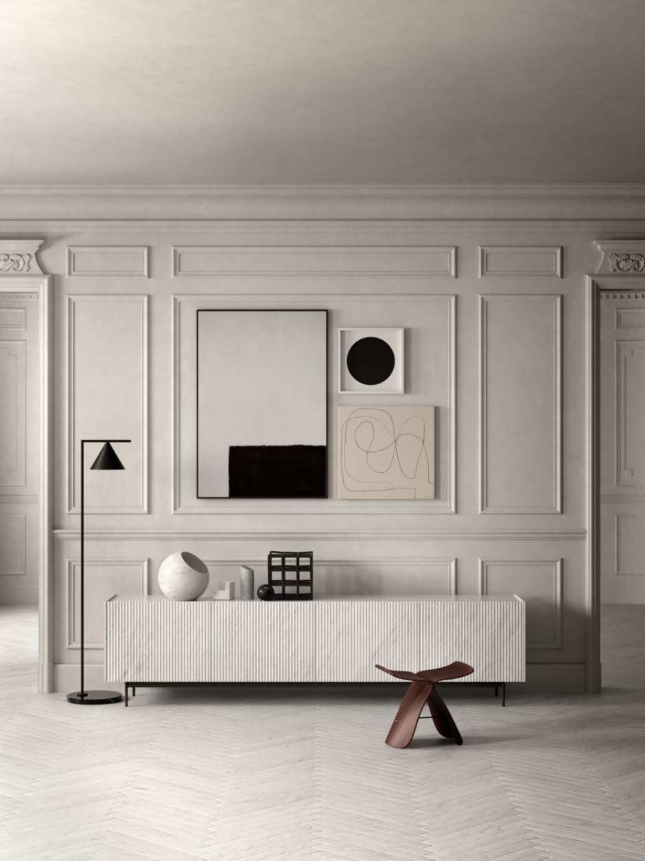
With a little more time on your hands than usual, many of you will be getting handy with some DIY and reaching for your paintbrush in hope to give your home a new lease of life. Before you do so, we’ve put together three of our tried and tested formulas to help you figure which paint style will best suit your space.
Dark Walls, Light Joinery
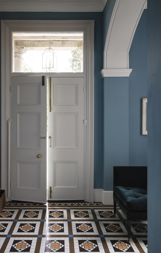
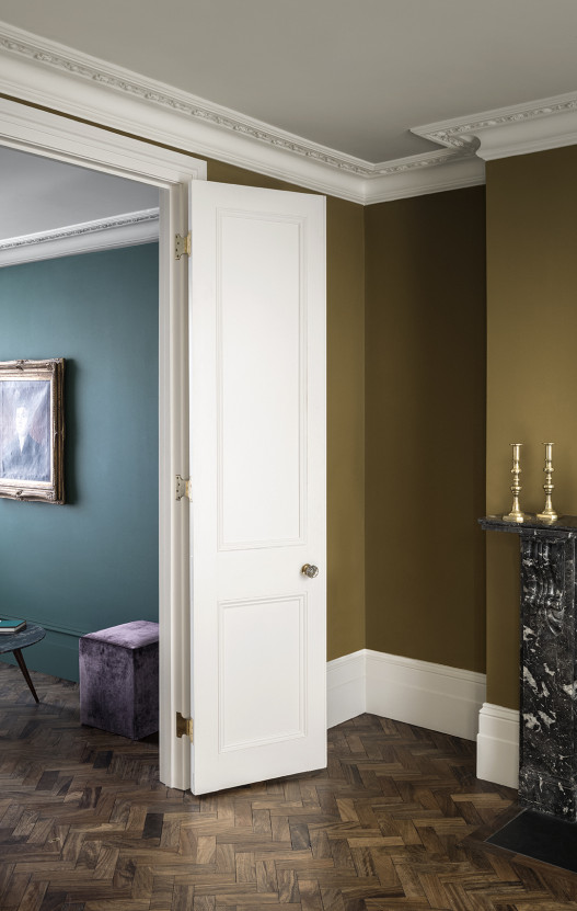
A more traditional style of decorating is to opt colour on the walls teamed with white woodwork.
When using colour or darker shades on walls, be brave, avoid the feature wall and go the whole hog! The idea is to appear intentional with your paint choices. Shifting to the dark side often works best in north facing spaces so embrace the low light. Remember, darker shades can always be elevated with the contrast of lighter shades above picture rails, on ceilings and joinery, or with furniture.
Whilst white woodwork can bring a crisp freshness to your scheme, the shade of white you use will make or break your home’s new look. Research your options before you revert to the some-what popular ‘brilliant white’. With it’s blue undertones, this can often appear stark and clinical. Instead, take the time to explore different shades of white. Farrow & Ball have a fabulous range of over twenty shades to choose from and if the wide variety intimidates you a little, F&B provide complimentary pairings with all of their colour options. Generally speaking, we advise you use cooler white with blue/grey undertones only in south-facing spaces. For anywhere else, opt for shades of white with a warm, soft undertone.
Of course joinery doesn’t have to be white. When experimenting with colour, try developing a monochromatic scheme and opt for lighter shades of the same tone. At Mon Interiors we love to use this trick to create a layered scheme that is both calming and visually interesting. The Paint & Paper Library has a beautiful collection of Architectural Paint offering 95 graduated shades with the same undertone, just at varied intensities.
Light Walls, Dark Joinery
We love a light and airy space and we are a big fan of timeless, classic neutrals. For something we think looks that little bit more sophisticated, try teaming lighter walls with darker joinery for contrast. You’ll notice wall colours seem lighter and airer and have a sleeker, contemporary edge. This contrast also works wonders in grounding your space and brings another dimension to your home interior. It works particularly well to frame doorways and windows, and can be used to draw the eye to a specific area of your home. Where you are sporting patterned wallpaper, try picking out a darker shade of colour within the pattern go help pull a room together for a more cohesive feel.
Utilising this painting style is wide in high traffic areas such as entrance halls and stairways. Darker shades on woodwork will withstand wear and tear better and fingerprints and marks are likely to be less visible – perfect where little children are present!
Again, the Architecural Paint collection at the Paint & Paper Library is a great place to start for a tonal look but for something higher in contrast, check out their Monochrome Collection. This collections presents six nuanced shades of black and white, perfectly formulated to be paired together for the ultimate in chic interior.
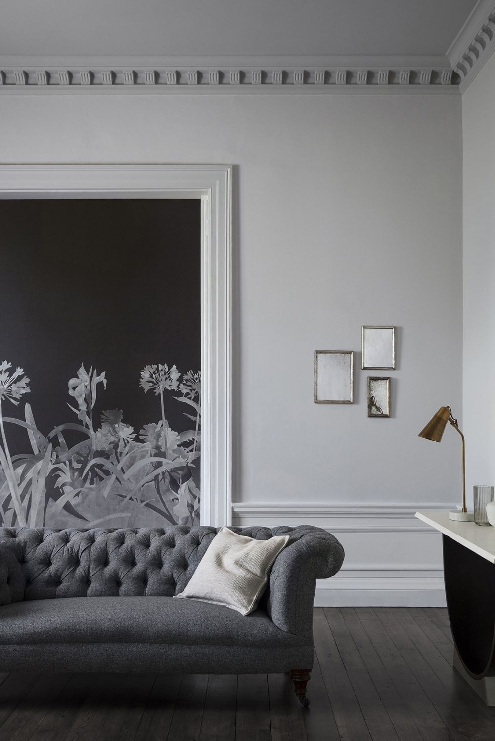
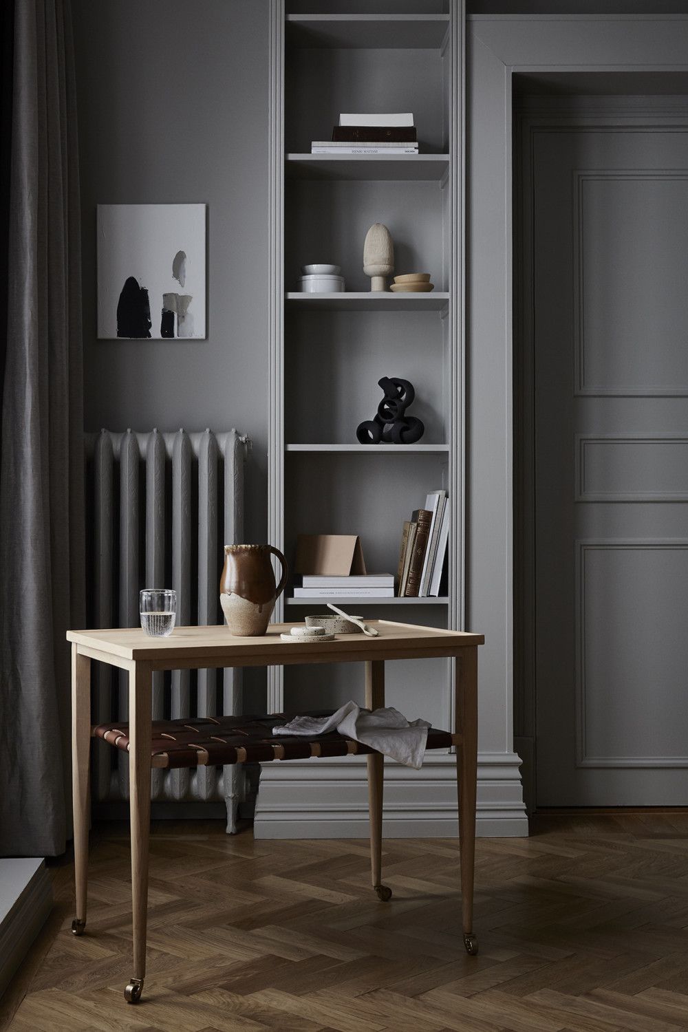
One colour Fits All
Choosing a singular colour for walls and joinery will not only make your space appear bigger but it helps evoke a calmer feel too. This is down to the subconscious effects of fewer breaks in the line of vision. This works particularly well with traditional architecture for a seamless, contemporary twist – an element we like to incorporate when bringing a period property into modern day living. This also allows architectural features and details to shine and provides the perfect blank canvas for interesting pieces of furniture or accessories. Where darker colours are being used, this is a great way to achieve a relaxing, cosy setting. For spaces such as cinema rooms or snugs, taking this a step further and painting ceilings in the same colour too can really accentuate a cocoon-like feeling.
Still not sure where to start? We provide colour consultation services both in person and remotely. Get in touch here for more information.

